The Digital Future Is Here – Is It Accessible?
Kindergartners through doctoral students went online in 2020, whether their schools were ready for digital accessibility or not. In this crash course in online learning, some students were left behind. One of the largest groups who were negatively impacted were students who have trouble seeing, hearing, memory challenges, or physical disabilities.
Behavioral science programs already understand the importance of accessibility but embracing digital technology can be a brand new challenge. It’s a crucial one to meet though to make sure your students can keep learning and your program avoids sticky legal situations. From your program’s website to the digital tools you use, everything must be accessible.
We’re going to walk you through the foundations of digital accessibility and talk about how going digital can also make your program more inclusive.
Accessible Digital Content
First, digital content must be accessible. That means anything on a screen should adhere to the Web Content Accessibility Guidelines 2.0 (WCAG 2.1 AA).
Most content falls into one (or more) of these four content types:
-
Images
-
Text
-
Audio
-
Video
Each of these must be accessible for people with vision, hearing, cognitive, and physical disabilities. To paint with broad strokes, that means making sure of the following:
- Images have text descriptions
- Videos and audio recordings have captions and/or text versions
- All text uses the simplest words possible
- When there are two layers (like text on top of an image), the colors must be distinct
- And finally, any format must be easy to navigate.
Your program’s marketing and IT teams are likely already on top of this for your university’s website and social media. They should have tools to help you if you develop your own materials as well.
And speaking of your program’s IT team, check with them before adopting any new digital tools. They probably have their own checklist to make sure new programs are accessible and will integrate with your other digital tools.
Accessible Digital Tools
Accessible digital tools follow similar rules as website content because after all, they’re also content that people use a screen to interact with. It’s crucial that programs choose partners who are committed to accessibility standards to ensure a good experience for all students.
How to make sure your digital solutions are accessible
The easiest thing you can do is ask your existing and prospective software vendors how they approach accessibility. Make sure they meet WCAG 2.1 AA and are committed to designing for all of your users.
For prospective vendors, take a test drive of their software systems. Ask yourself how easy it is to use. Designing for accessibility means intuitive design, which makes for a better experience for all users.
It’s crucial to choose a partner that designs with accessibility in mind. It’s not just about the student experience though that is the most important factor. If your program chooses a software vendor who does not meet web accessibility standards, you risk losing students and could face legal challenges.
How digital solutions can enhance accessibility
Too often accessibility standards fall into a list that has to be checked off. But when we design software with accessibility in mind from the start, the whole product gets better and every user benefits.
Going digital also allows programs to open up their geographic footprint. Online learning is now a real, valuable option. It doesn’t replace all of the benefits of face-to-face instruction but it can open new educational doors for people who previously had none.
Digital tools, like Tevera, can also solve some of the most challenging obstacles facing field experiences and internships by eliminating communication barriers and allowing programs and sites to build unique opportunities for their students that simply weren’t possible before the internet.
Simplicity is at the heart of good design and it’s at the center of accessibility. So as long as programs choose software partners who focus on accessibility, the user experience for students, faculty, and supervisors is enhanced.
Accessible Field Education and Internships
Behavioral science programs revolve around real-life, hands-on experience. How do those physical experiences translate online?
Some services will never to be able to go fully online. But the way students, supervisors, and faculty manage their piece of the field experience puzzle can go digital and the benefits of doing so can ripple throughout the entire field system.
How Tevera Puts Digital Accessibility at the Center of Field Education and Internships
Beyond making sure our software meets accessibility standards and beyond continuous enhancements, we put digital accessibility at the heart of field education, internships, and internships so everyone involved has a better experience.
Communication
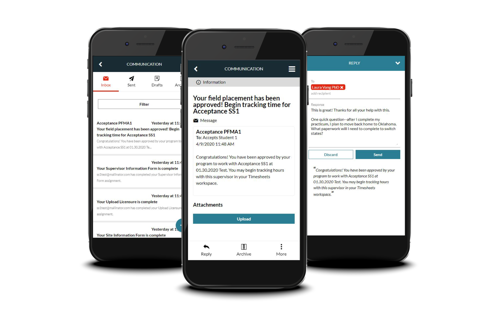
We make it easy for students to communicate with site supervisors and faculty members through mobile-friendly messaging.
Reporting
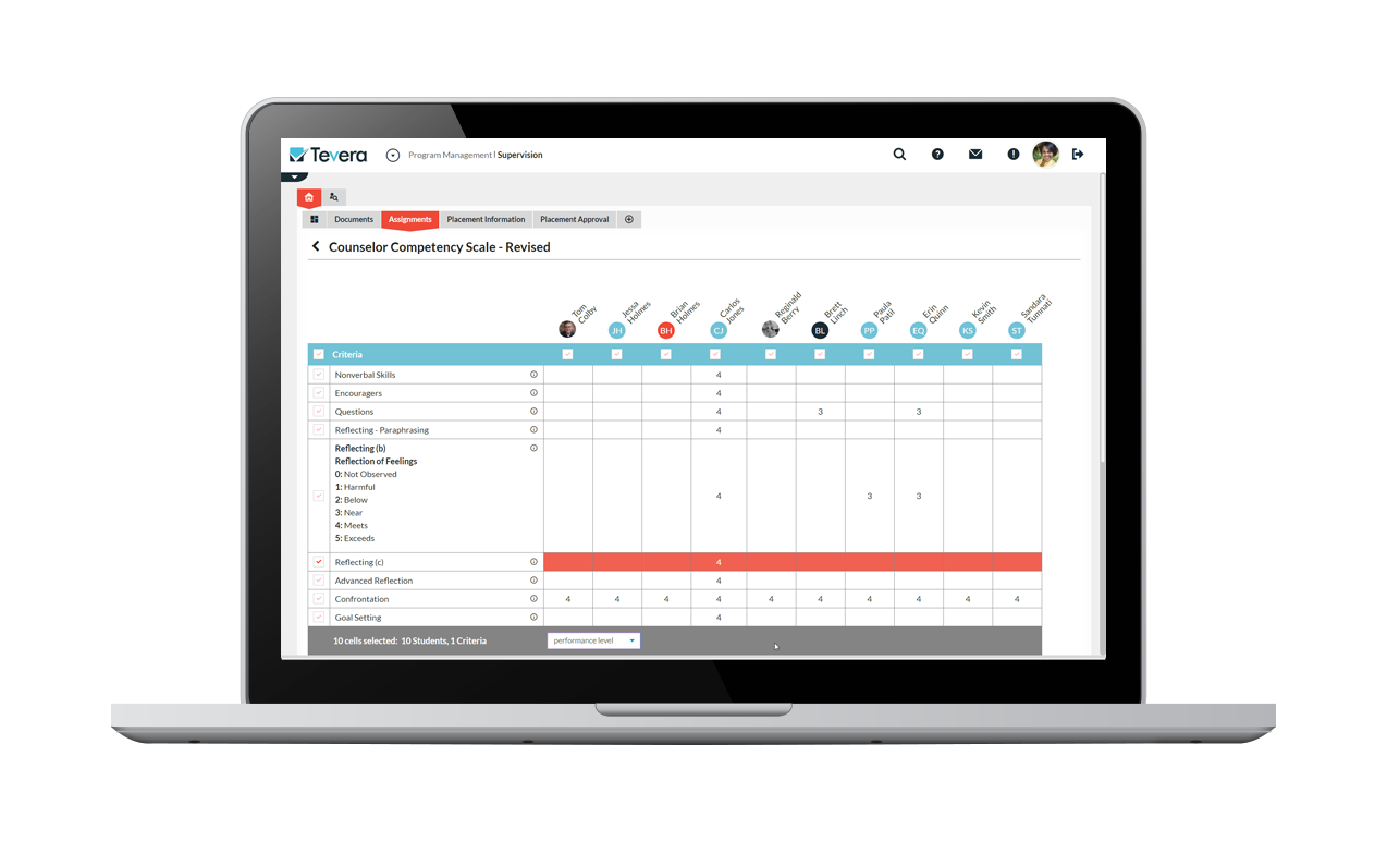
Using paper and spreadsheets to manage information about sites and analyze their performance isn’t easy. Our data management system changes all of that so you can manage your data and generate reports in just a few clicks.
Tracking Progress
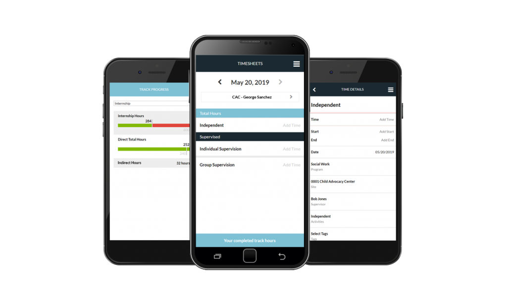
View your students’ progress in one, intuitive dashboard and make sure none of them fall behind.
Making sure your web content is accessible isn’t just an ethical obligation. It’s good for business and is the law. Partner with software vendors who are committed to meeting accessibility standards and make a plan to enhance your owned web content.
Besides, accessible design is just good design. When we design something simply, everyone benefits. Let’s embrace this digital transformation and make it work for everyone by focusing on accessible tools.
SOLUTIONS
RELATED POSTS
PRODUCT OVERVIEW
See how Tevera can elevate your program.
The Digital Future Is Here – Is It Accessible?
Kindergartners through doctoral students went online in 2020, whether their schools were ready for digital accessibility or not. In this crash course in online learning, some students were left behind. One of the largest groups who were negatively impacted were students who have trouble seeing, hearing, memory challenges, or physical disabilities.
Behavioral science programs already understand the importance of accessibility but embracing digital technology can be a brand new challenge. It’s a crucial one to meet though to make sure your students can keep learning and your program avoids sticky legal situations. From your program’s website to the digital tools you use, everything must be accessible.
We’re going to walk you through the foundations of digital accessibility and talk about how going digital can also make your program more inclusive.
Accessible Digital Content
First, digital content must be accessible. That means anything on a screen should adhere to the Web Content Accessibility Guidelines 2.0 (WCAG 2.1 AA).
Most content falls into one (or more) of these four content types:
-
Images
-
Text
-
Audio
-
Video
Each of these must be accessible for people with vision, hearing, cognitive, and physical disabilities. To paint with broad strokes, that means making sure of the following:
- Images have text descriptions
- Videos and audio recordings have captions and/or text versions
- All text uses the simplest words possible
- When there are two layers (like text on top of an image), the colors must be distinct
- And finally, any format must be easy to navigate.
Your program’s marketing and IT teams are likely already on top of this for your university’s website and social media. They should have tools to help you if you develop your own materials as well.
And speaking of your program’s IT team, check with them before adopting any new digital tools. They probably have their own checklist to make sure new programs are accessible and will integrate with your other digital tools.
Accessible Digital Tools
Accessible digital tools follow similar rules as website content because after all, they’re also content that people use a screen to interact with. It’s crucial that programs choose partners who are committed to accessibility standards to ensure a good experience for all students.
How to make sure your digital solutions are accessible
The easiest thing you can do is ask your existing and prospective software vendors how they approach accessibility. Make sure they meet WCAG 2.1 AA and are committed to designing for all of your users.
For prospective vendors, take a test drive of their software systems. Ask yourself how easy it is to use. Designing for accessibility means intuitive design, which makes for a better experience for all users.
It’s crucial to choose a partner that designs with accessibility in mind. It’s not just about the student experience though that is the most important factor. If your program chooses a software vendor who does not meet web accessibility standards, you risk losing students and could face legal challenges.
How digital solutions can enhance accessibility
Too often accessibility standards fall into a list that has to be checked off. But when we design software with accessibility in mind from the start, the whole product gets better and every user benefits.
Going digital also allows programs to open up their geographic footprint. Online learning is now a real, valuable option. It doesn’t replace all of the benefits of face-to-face instruction but it can open new educational doors for people who previously had none.
Digital tools, like Tevera, can also solve some of the most challenging obstacles facing field experiences and internships by eliminating communication barriers and allowing programs and sites to build unique opportunities for their students that simply weren’t possible before the internet.
Simplicity is at the heart of good design and it’s at the center of accessibility. So as long as programs choose software partners who focus on accessibility, the user experience for students, faculty, and supervisors is enhanced.
Accessible Field Education and Internships
Behavioral science programs revolve around real-life, hands-on experience. How do those physical experiences translate online?
Some services will never to be able to go fully online. But the way students, supervisors, and faculty manage their piece of the field experience puzzle can go digital and the benefits of doing so can ripple throughout the entire field system.
How Tevera Puts Digital Accessibility at the Center of Field Education and Internships
Beyond making sure our software meets accessibility standards and beyond continuous enhancements, we put digital accessibility at the heart of field education, internships, and internships so everyone involved has a better experience.
Communication
We make it easy for students to communicate with site supervisors and faculty members through mobile-friendly messaging.

Reporting
Using paper and spreadsheets to manage information about sites and analyze their performance isn’t easy. Our data management system changes all of that so you can manage your data and generate reports in just a few clicks.

Tracking Progress
View your students’ progress in one, intuitive dashboard and make sure none of them fall behind.

Making sure your web content is accessible isn’t just an ethical obligation. It’s good for business and is the law. Partner with software vendors who are committed to meeting accessibility standards and make a plan to enhance your owned web content.
Besides, accessible design is just good design. When we design something simply, everyone benefits. Let’s embrace this digital transformation and make it work for everyone by focusing on accessible tools.
The Digital Future Is Here – Is It Accessible?
Kindergartners through doctoral students went online in 2020, whether their schools were ready for digital accessibility or not. In this crash course in online learning, some students were left behind. One of the largest groups who were negatively impacted were students who have trouble seeing, hearing, memory challenges, or physical disabilities.
Behavioral science programs already understand the importance of accessibility but embracing digital technology can be a brand new challenge. It’s a crucial one to meet though to make sure your students can keep learning and your program avoids sticky legal situations. From your program’s website to the digital tools you use, everything must be accessible.
We’re going to walk you through the foundations of digital accessibility and talk about how going digital can also make your program more inclusive.
Accessible Digital Content
First, digital content must be accessible. That means anything on a screen should adhere to the Web Content Accessibility Guidelines 2.0 (WCAG 2.1 AA).
Most content falls into one (or more) of these four content types:
-
Images
-
Text
-
Audio
-
Video
Each of these must be accessible for people with vision, hearing, cognitive, and physical disabilities. To paint with broad strokes, that means making sure of the following:
- Images have text descriptions
- Videos and audio recordings have captions and/or text versions
- All text uses the simplest words possible
- When there are two layers (like text on top of an image), the colors must be distinct
- And finally, any format must be easy to navigate.
Your program’s marketing and IT teams are likely already on top of this for your university’s website and social media. They should have tools to help you if you develop your own materials as well.
And speaking of your program’s IT team, check with them before adopting any new digital tools. They probably have their own checklist to make sure new programs are accessible and will integrate with your other digital tools.
Accessible Digital Tools
Accessible digital tools follow similar rules as website content because after all, they’re also content that people use a screen to interact with. It’s crucial that programs choose partners who are committed to accessibility standards to ensure a good experience for all students.
How to make sure your digital solutions are accessible
The easiest thing you can do is ask your existing and prospective software vendors how they approach accessibility. Make sure they meet WCAG 2.1 AA and are committed to designing for all of your users.
For prospective vendors, take a test drive of their software systems. Ask yourself how easy it is to use. Designing for accessibility means intuitive design, which makes for a better experience for all users.
It’s crucial to choose a partner that designs with accessibility in mind. It’s not just about the student experience though that is the most important factor. If your program chooses a software vendor who does not meet web accessibility standards, you risk losing students and could face legal challenges.
How digital solutions can enhance accessibility
Too often accessibility standards fall into a list that has to be checked off. But when we design software with accessibility in mind from the start, the whole product gets better and every user benefits.
Going digital also allows programs to open up their geographic footprint. Online learning is now a real, valuable option. It doesn’t replace all of the benefits of face-to-face instruction but it can open new educational doors for people who previously had none.
Digital tools, like Tevera, can also solve some of the most challenging obstacles facing field experiences and internships by eliminating communication barriers and allowing programs and sites to build unique opportunities for their students that simply weren’t possible before the internet.
Simplicity is at the heart of good design and it’s at the center of accessibility. So as long as programs choose software partners who focus on accessibility, the user experience for students, faculty, and supervisors is enhanced.
Accessible Field Education and Internships
Behavioral science programs revolve around real-life, hands-on experience. How do those physical experiences translate online?
Some services will never to be able to go fully online. But the way students, supervisors, and faculty manage their piece of the field experience puzzle can go digital and the benefits of doing so can ripple throughout the entire field system.
How Tevera Puts Digital Accessibility at the Center of Field Education and Internships
Beyond making sure our software meets accessibility standards and beyond continuous enhancements, we put digital accessibility at the heart of field education, internships, and internships so everyone involved has a better experience.
Communication
We make it easy for students to communicate with site supervisors and faculty members through mobile-friendly messaging.

Reporting
Using paper and spreadsheets to manage information about sites and analyze their performance isn’t easy. Our data management system changes all of that so you can manage your data and generate reports in just a few clicks.

Tracking Progress
View your students’ progress in one, intuitive dashboard and make sure none of them fall behind.

Making sure your web content is accessible isn’t just an ethical obligation. It’s good for business and is the law. Partner with software vendors who are committed to meeting accessibility standards and make a plan to enhance your owned web content.
Besides, accessible design is just good design. When we design something simply, everyone benefits. Let’s embrace this digital transformation and make it work for everyone by focusing on accessible tools.


