Approve Field Placements & Pre-Application Tasks in a Single Screen
FIELD PLACEMENT APPROVAL
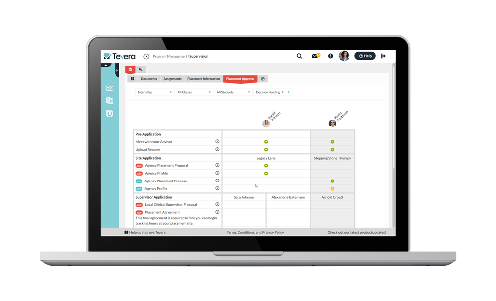
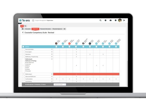
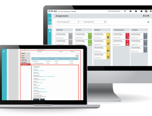
Our new grid layout makes it easy to track of student progress towards placement. This new ‘single screen’ design allows you to see every task a student needs to complete plus their progress towards completion, saving you valuable time, especially with larger programs.
Highlights
- Faculty members reviewing applications will be able to see a student’s entire application in one place, even if the student is applying to more than one site or supervisor.
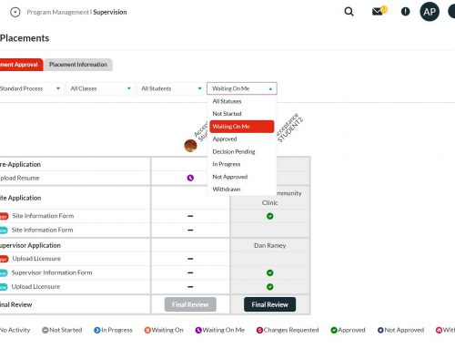
- See which students haven’t started their process with the status filter for “Not Started.” This will show all students who have a process available to them, but have not started those tasks.
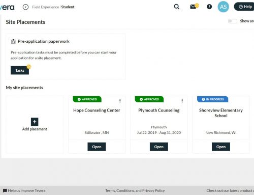
- Keep all documentation for placement in one place. If your process has pre-application tasks, such as a student uploading documents about themselves, or their site preferences, those will be seen here, too.
Knowledge Base Articles
Visit our Knowledge Base for these articles:
SOLUTIONS
RELATED POSTS
PRODUCT OVERVIEW
See how Tevera can elevate your program.
Approve Field Placements & Pre-Application Tasks in a Single Screen
FIELD PLACEMENT APPROVAL
Our new grid layout makes it easy to track of student progress towards placement. This new ‘single screen’ design allows you to see every task a student needs to complete plus their progress towards completion, saving you valuable time, especially with larger programs.
Highlights
- Faculty members reviewing applications will be able to see a student’s entire application in one place, even if the student is applying to more than one site or supervisor.
- See which students haven’t started their process with the status filter for “Not Started.” This will show all students who have a process available to them, but have not started those tasks.
- Keep all documentation for placement in one place. If your process has pre-application tasks, such as a student uploading documents about themselves, or their site preferences, those will be seen here, too.
Knowledge Base Articles
Visit our Knowledge Base for these articles:
